MOBILE EXPLORE CARD

The Mobile Explore Card is meant to be a personalized, data driven solution allowing travelers to explore the area they are visiting.

THE PILOT
Current TripIt users who were attending a conference in San Francisco were meant to be the initial audience of this TripIt mobile app add-on. The goal was to find out whether or not the functionality provided by the Explore Card would be something users would gravitate towards. Transportation, dining and local search suggestions were the initial components explored for the pilot.
It was critical that the Explore Card not be invasive or get in the way of the core components of the TripIt mobile app, which mainly focuses on organizing travel plans. In order to make sure that was the case, some basic logic for the card’s placement within the app had to be defined.
ACTIVE TRIP OR PLAN OBJECT
If user is currently in the middle of their trip or they have a trip plan upcoming within an hour after the scheduled event, show trip or plan object by default, Explore Card one card to the right.
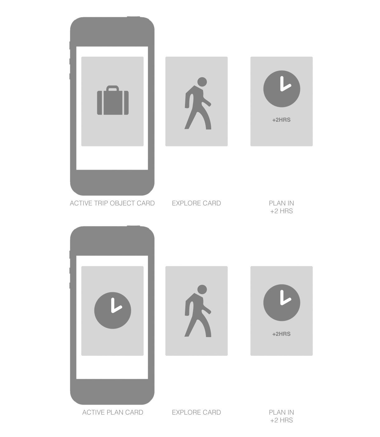
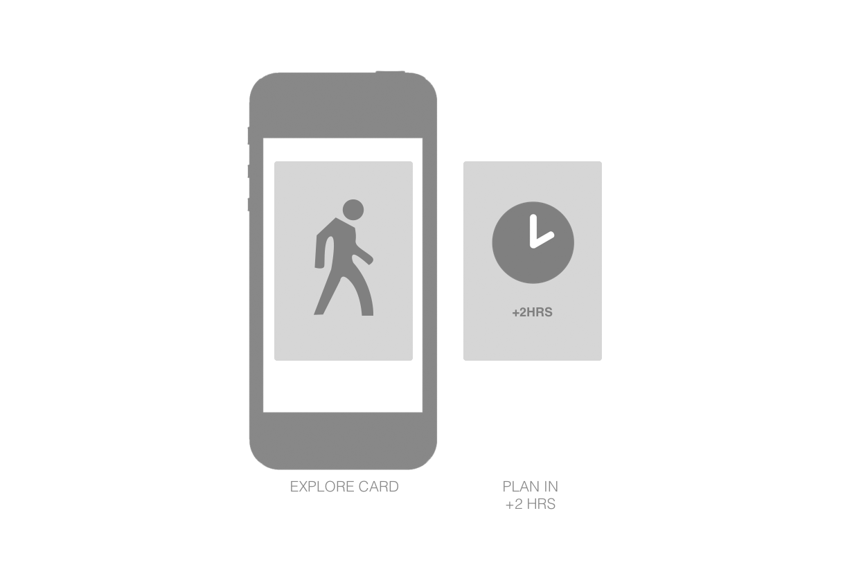
AUPCOMING TRIP OR PLAN
If the first plan in the trip starts after more than 2hrs relative to current time, then Explore Card is placed as the first card and is displayed by default.
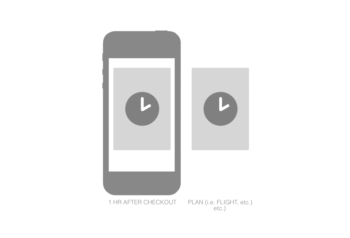
KNOW WHEN TO HIDE
Explore Card goes away 1 hr after hotel checkout time, which usually indicates that the user is about to leave the area of interest.

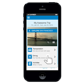
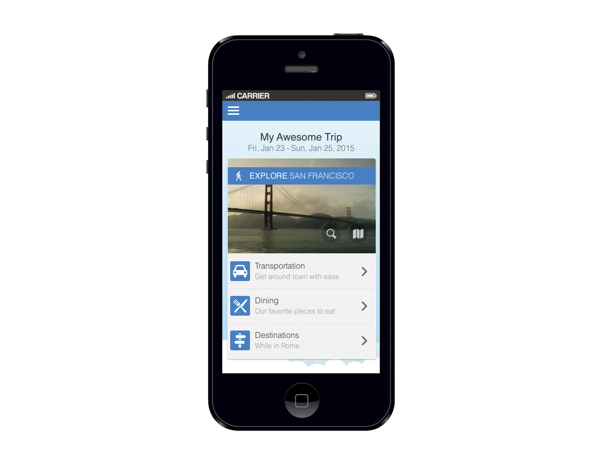
HOME SCREEN
The Explore Card is accessed from various places within the TripIt app depending on the situation. These scenarios are outlined in the Logic portion of this document. The following is an overview of the Explore Card's landing page within an active trip object.
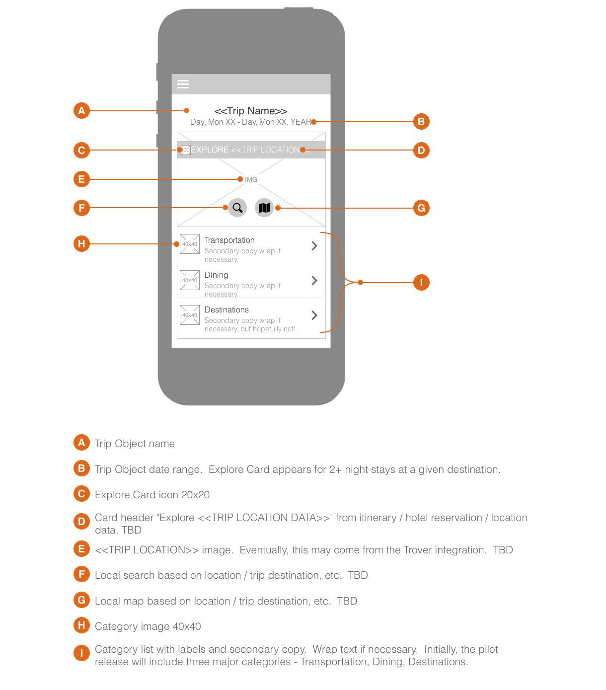
Explore Card Home screen mockup.

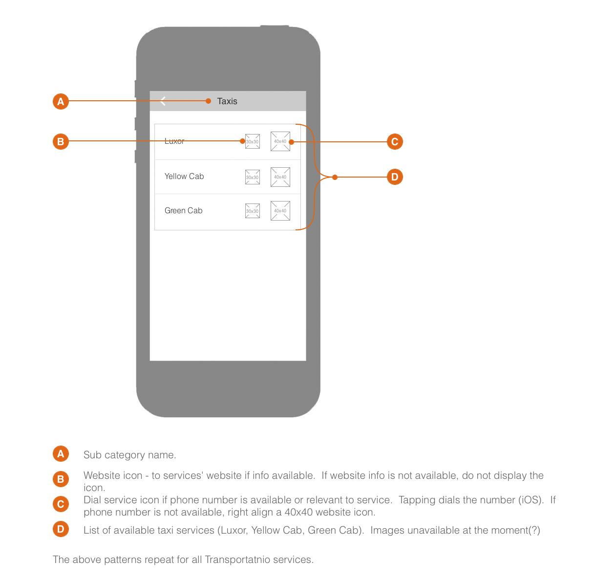
TRANSPORTATION SCREENS
The following is an overview of the Explore Card's Transportation page. User selects Transportation from Explore Card Home screen, lands on Transportation landing screen.
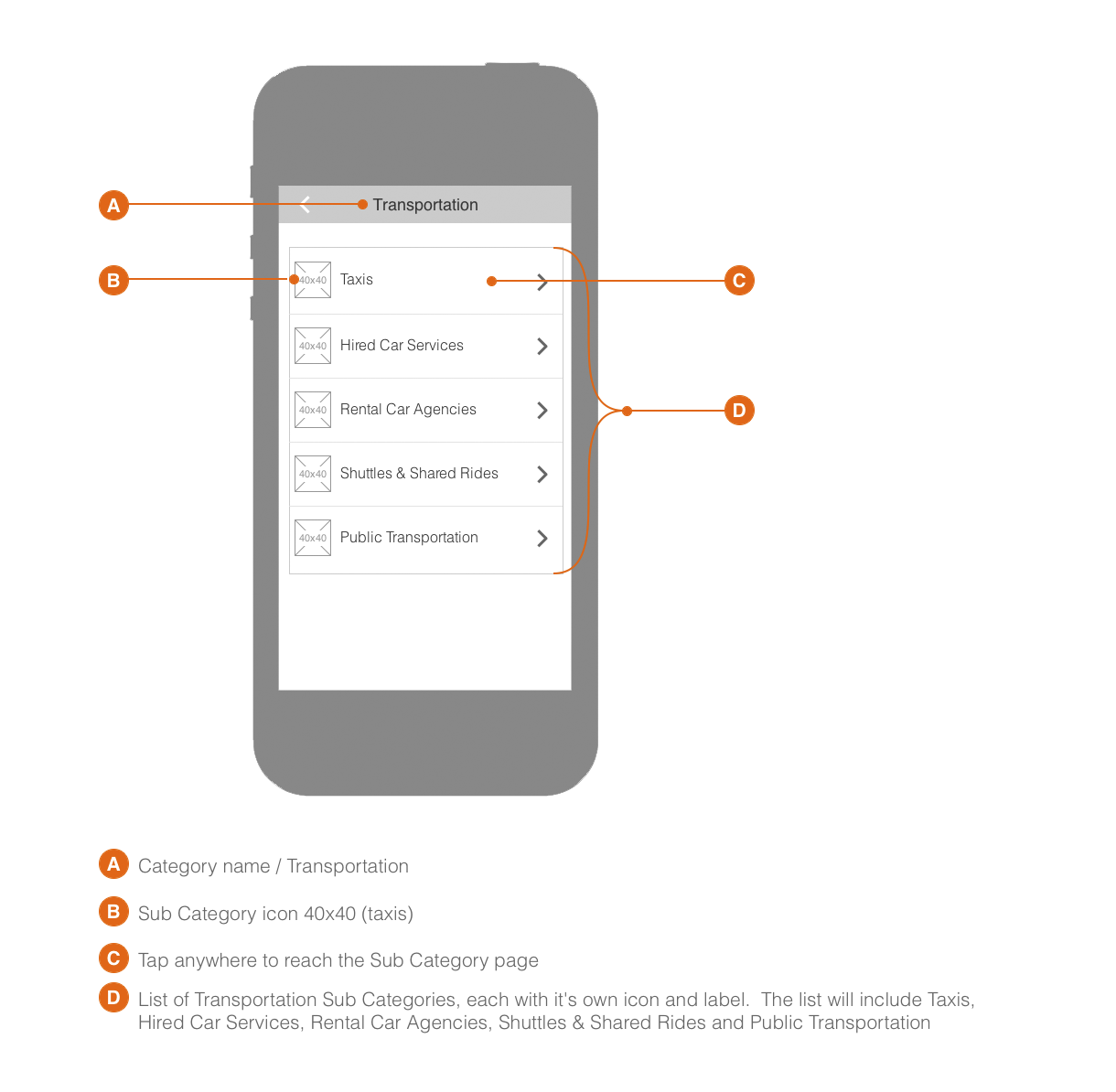
Explore Card Transportation landing screen mockup.
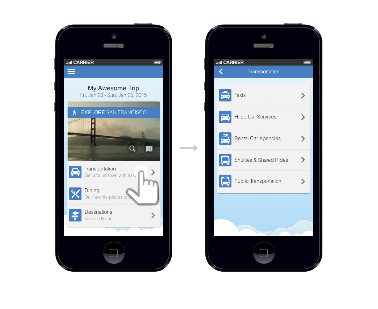
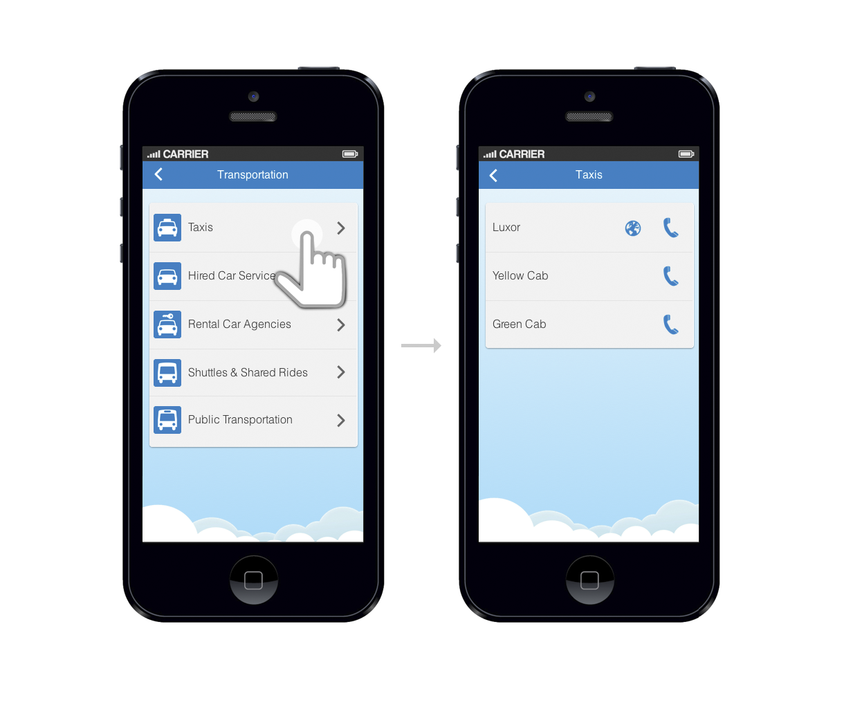
User selects Transportation from Explore Card landing, then chooses a desired service.
Transportation service screen mockup.

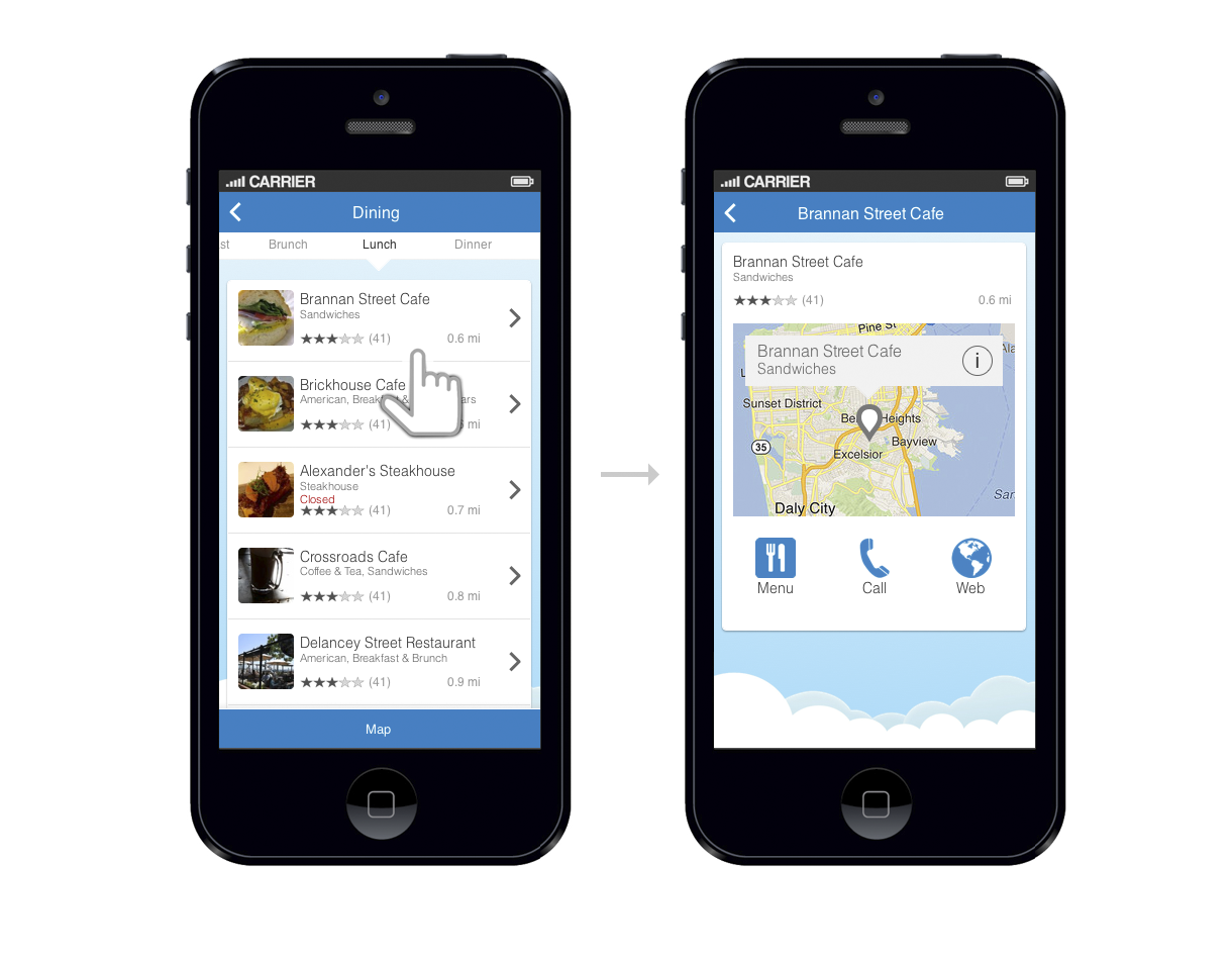
DINING SCREENS
Dining screens for Explore Card. Default sort is based on the combination of distance and rating.
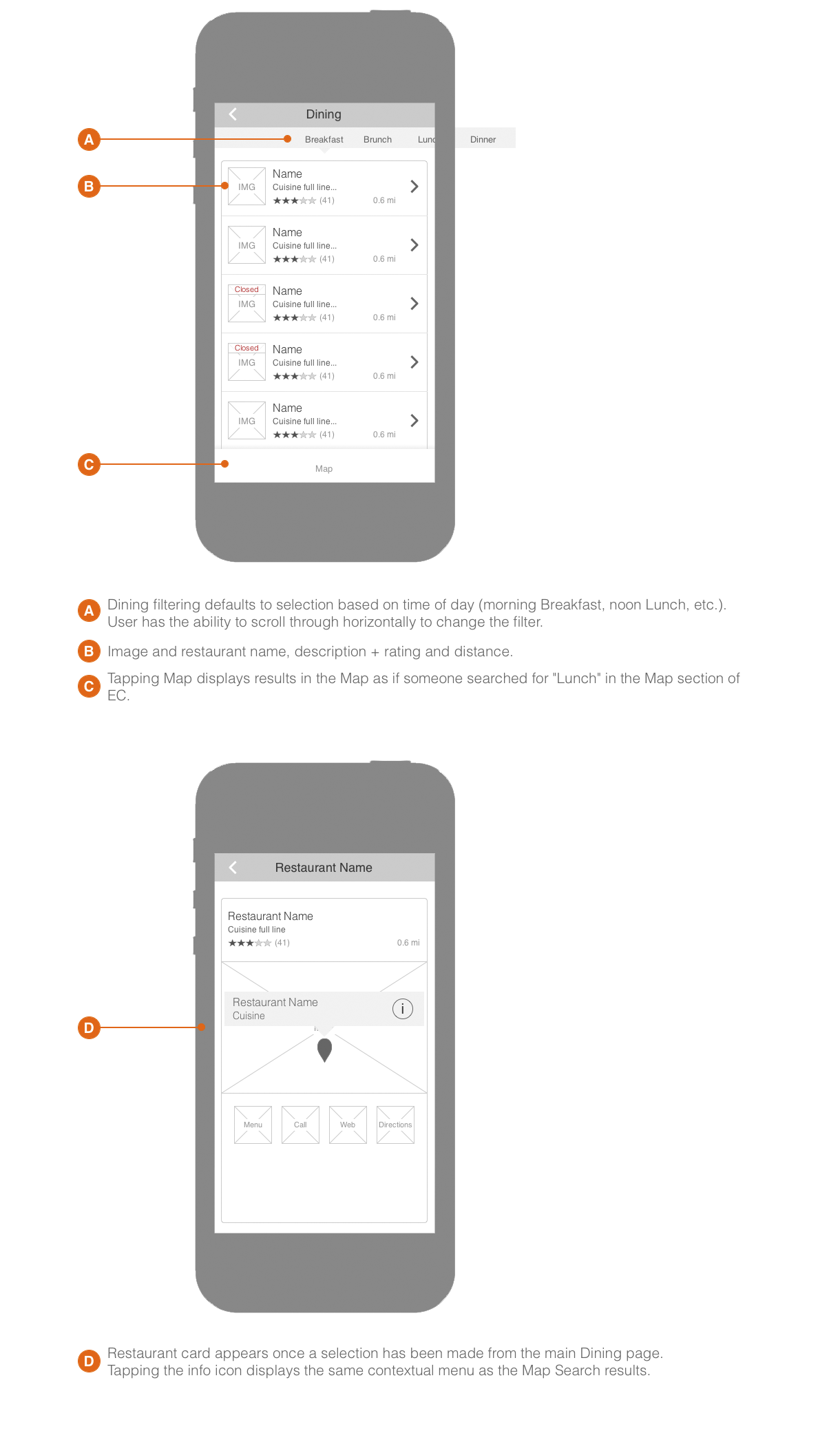
The corresponding mockups.
DESIGN

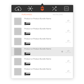
MARKETPLACE
The Gobbler Marketplace is a revolutionary ecommerce platform bringing the subscription model to the world of audio plugins. Home recording enthusiasts, professional audio producers, radio station and tv audio engineers have an opportunity to add world class audio plugins to their arsenals on demand.

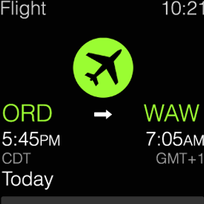
TRAVEL APPLE WATCH
During this short and very fast paced project, my initial goal was to understand the anatomy and design capabilities of the Apple Watch. Without the actual device in my hands, the most reliable source of knowledge was the Apple Watch Human Interface Guidelines document. Armed with patience, but eager to begin the design process, I set out to do some research.


EMAIL DESIGN
The project called for collecting information about every single email sent out to the users by the system, then standardizing the language, appearance and building new HTML/CSS templates.
OS X CLIENT APP CONCEPTS
Aside from syncing and versioning backed up creative assets, the Gobbler Client App offers a unique ability to license and manage audio plugin subscriptions purchased through the Gobbler Marketplace. This concept project focused on redesigning those screens.
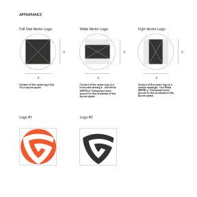
PUBLISHER DESIGN GUIDELINES
The Publisher Design Guidelines is an all encompassing visual style guide providing publishers with the information they need in order to produce appropriate visual assets for use within the Gobbler universe.
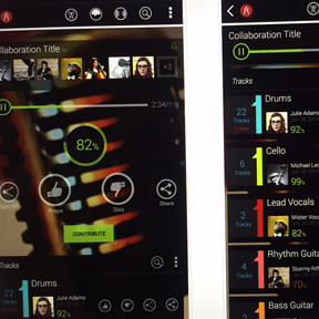
MUSIC COLLABORATION
Audiocitizen is meant to help recording artists enhance creativity and increase exposure by offering a simple and effective music collaboration tool. It presents an opportunity to showcase musical talent driven by constant, round-the-clock outpour of creativity through crowdsourcing.
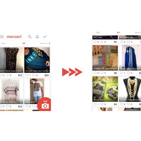
MOBILE USABILITY IMPROVEMENTS
I had a chance to play around with a beautifully designed Japanese mobile app Mercari. According to the company, "Mercari is the biggest community-powered shopping fair in the palm of your hand. Shop from thousands of sellers with one-click purchases, and quickly sell your own new, pre-owned or handmade items." It's an amazing app, however, during my review, I took a stab at the top 10 usability improvements the app could use before moving to the U.S. market. Check them out!
E-COM CART & CHECKOUT REDESIGN
It’s the cash register we’re talking about here. Yeah, it’s kind of important that it works. Otherwise, we might as well pack up our bags and look for an entertaining project elsewhere. No moola, no fun and games.