E-COMM CART & CHECKOUT REDESIGN

It’s the cash register we’re talking about here. Yeah, it’s kind of important that it works. Otherwise, we might as well pack up our bags and look for an entertaining project elsewhere. No moola, no fun and games.

THE ASK
The client reached out asking for "simple, cosmetic changes" to the existing checkout experience. It was critical that we keep those as "on the surface" as possible, maintaining as much of the current functionality as possible. The goal, in a nutshell, was to achieve the following:
- • Simple update to look and feel to align with the rest of our sites
- • Consolidation of steps within the checkout process
- • Clear progress indicator and navigation between checkout steps
- • Visible, persistent Order Summary module
- • Very clear order completion step (big one!)
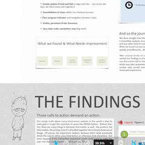
We dove straight into the discovery phase of the current state of things. Competitive analysis, heuristic evaluations, customer feedback, analytics and any other kind of research we could get our hands on were all game. What we found out was eye opening. We needed to fix a serious problem quickly and efficiently. After several weeks of serious investigative work, we have presented our findings to the internal stakeholders. Subsequently, numerous discussions led to the creation of the proposed solutions document, which was later presented to a broader audience including the 3rd party vendor who would eventually be responsible for implementing the revamped experience.
THOSE CALLS TO ACTION DEMAND AN ACTION
The simple truth about every ecommerce website in the world is that its main goal is to convince the customer to press the SUBMIT ORDER button. Naturally there are many things in between that matter as well - product, information, pricing, how it’s all pulled together into a lovely showcase of things. Of course, the experience matters, because that’s what eventually drives the user to either press that button or look elsewhere. But what if the experience works really hard to make users are very confused about what actions to take?
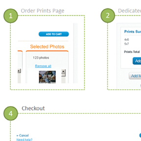
The following screen shows sets of primary, secondary, and occasionally tertiary calls to action throughout the checkout experience. The major usability concern with these is their inconsistency in appearance, placement, grouping, as well as proximity to each other, especially when considering mobile devices.
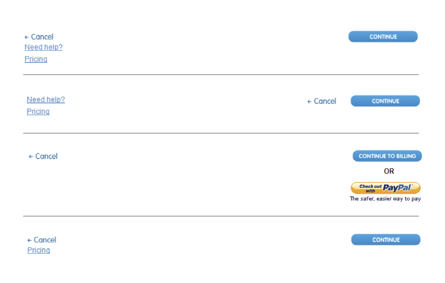
SOLUTION
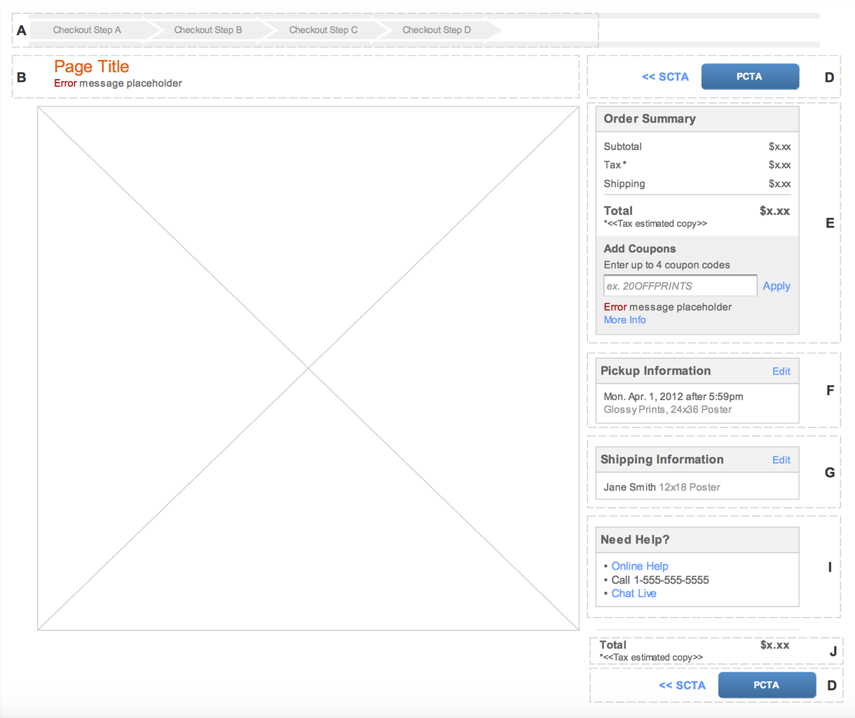
Standardize appearance, placement and labeling of all CTAs within a persistent Order Summary module.
I LOVE THIS BAR
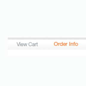
The progress indicator / progress bar is meant to correctly indicate users’ place within a linear process - how far along they are and how many steps they have left to completion.
What we found was that the progress indicator did not accurately allow users to predict what steps they'll be taking. While each of the screens associated with these steps followed a different design pattern, not to mention the fact that the process started on step #2 titled "Order Info," inconsistencies in labeling language were a usability concern as well.
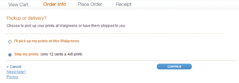
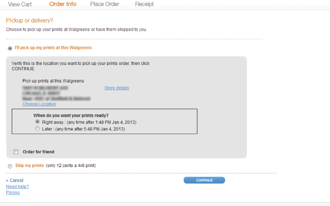
PICKUP OR DELIVERY?
Progress indicator on the Pickup vs. Ship screen.
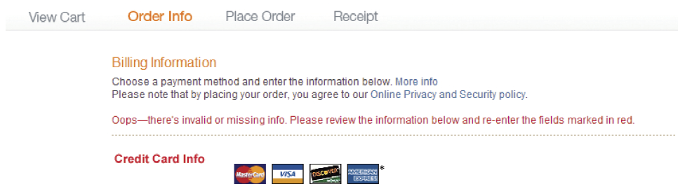
BILLING INFO V1
The indicator on one of several Billing Info pages.
BILLING INFO V2
An alternative version of the Billing Info screen and its progress indicator.
BILLING INFO V3
Yet another Billing Info page.
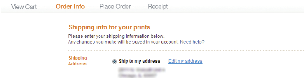
SHIPPING INFO
Shipping Info screen and its progress indicator.
SOLUTION
Implement a dynamic progress indicator that will accurately reflect a flow the user is in depending on the type of order and what we already know about the user (i.e. pickup, delivery, signed in user, existing payment information and a default pickup location).
RADIO (BUTTONS) GA GA
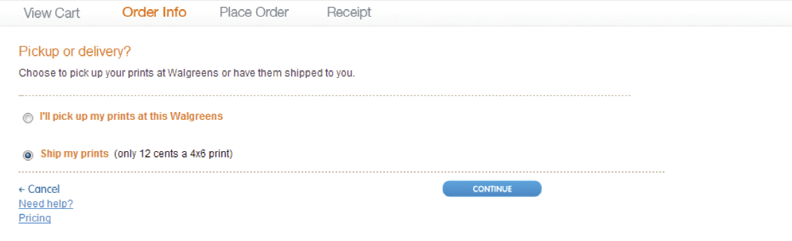
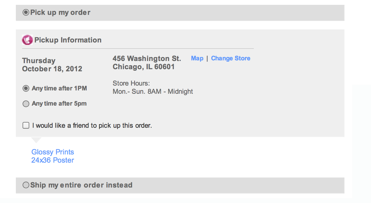
Poor form design aside, another hiccup we’ve uncovered dealt with inconsistent radio button interactions. Selecting various radio buttons produced often unexpected results. For instance, while selecting the "I’ll pick up my prints at this Walgreens" option revealed information pertaining to a previously saved default location, selecting the alternative option labeled "Ship my prints" revealed absolutely nothing.
PICK UP THE PRINTS
User chooses to pick up their order at a local store with the ability to change that location.
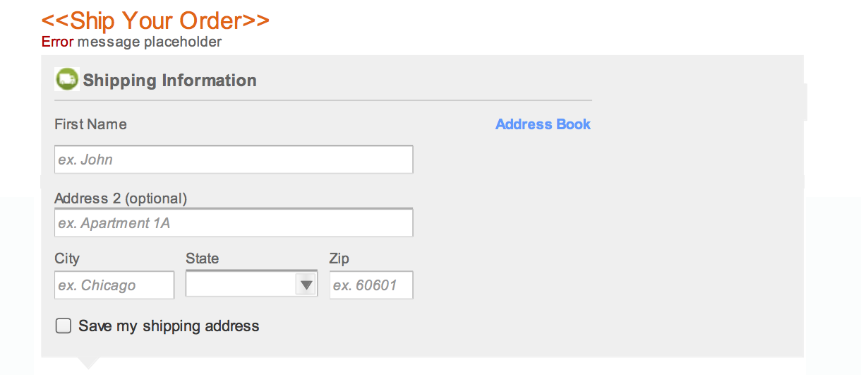
SHIP THE PRINTS
User chooses to ship the prints, but is left guessing about what to do next.
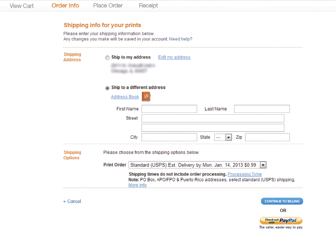
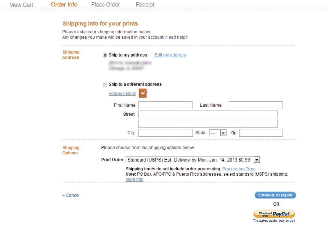
In another instance, it didn’t seem to matter whether a user elected to ship the prints to an existing or a new address. The form fields remained displayed in both cases, which posed a very error prone usability problem. In case someone wanted to fill in the information about a new shipping address and pressed Continue, they would have missed selecting the radio button responsible for electing the new shipping address option. As a result, if the error is not caught before order submission, the prints will be shipped to the existing, default address, not the newly specified one. This problem occurred in various places throughout the site.
SHIP TO NEW ADDRESS
The new address form appears.
SHIP TO EXISTING ADDRESS
The choice is obvious, but why is the new address form still visible?
PICKUP OR SHIP SOLUTION
Unfortunately, the inability to dipslay shipping information once that option was selected on the fulfillment screen turned out to be a technical limiatation, so we stuck with it. But the form was cleaned up.
SHIPPING ADDRESSES SOLUTION
What user sees on this screen depends entirely on what the system knows about the users. If they're new or have never shipped any prints from the site, a new shipping address form appears at this stage.
Otherwise, if we recognize the user as a returning customer, we display their default shipping address with the ability to edit it or pick a new one from their address book.


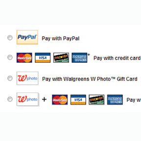
THERE IS MORE
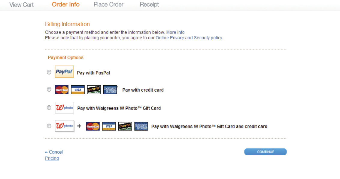
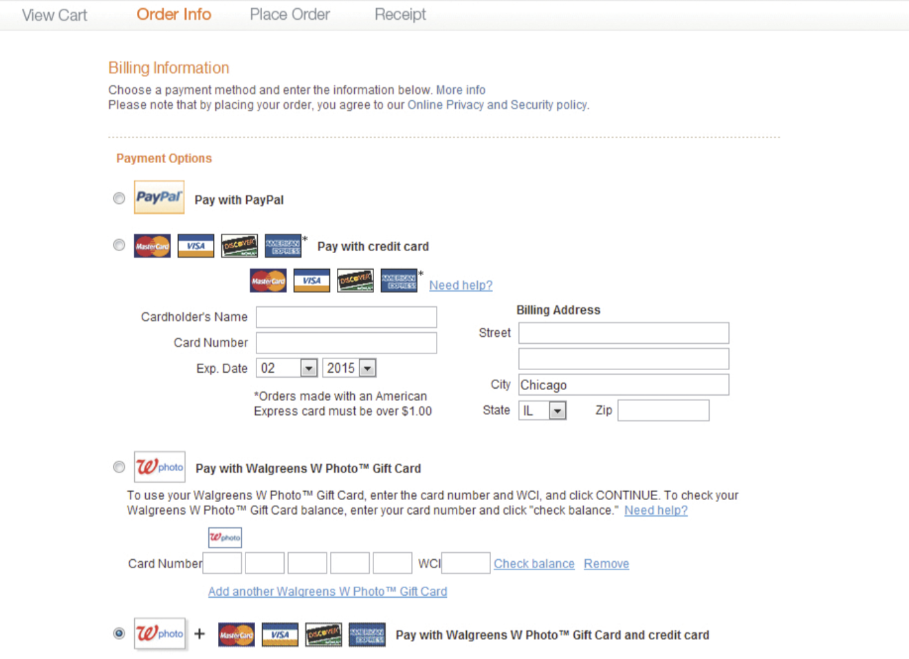
While selecting a single form of payment makes sense and displays relevant information, choosing a combined payment option simply unveils all of the options. To add to that, the forms user is asked to fill out appear above the radio button selection, reversing the natural flow of the page, which, barring localization, tends to be top-down.
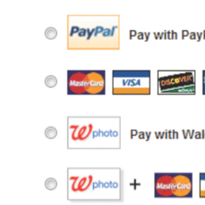
PICK A METHOD, ANY METHOD
A selection of available methods of payment.
COMBINED PAYMENT OPTIONS
The option to pay using multiple methods.
TOP PAY OR NOT TO PAY
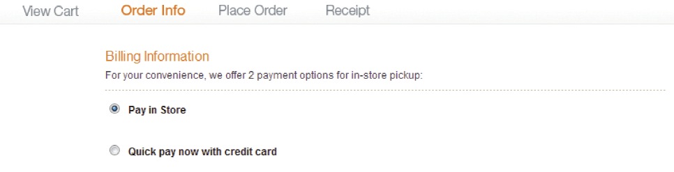
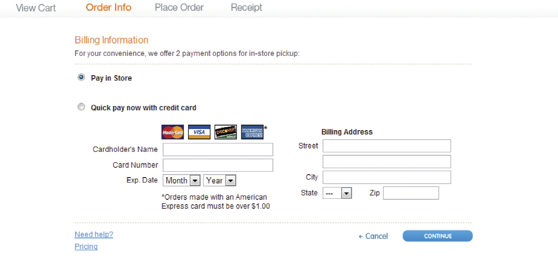
Almost all online orders are picked up at local stores, which means that users place their orders through the website and go into their favorite store to pick it up, hopefully grabbing a gallon of milk while they’re there. Sounds like a great business model.
The trouble lies in the Billing Information section of the online experience. While there, users are offered two options: 1. “Pay in Store” and 2. "Quick pay now with credit card." The first offense occurs when users are asked to fill out their credit card information regardless of the option they’ve selected. What they do not know is that the financial transaction does not take place online if the order is meant to be picked up at a store. Many customers feel that they’ve purchased the product inline and all they need to do is to pick it up. That’s when the second offense happens. It’s needless to say that frustration kicks in when they’re given a balance to pay at the time of pickup.
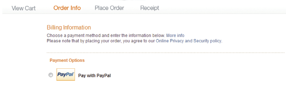
PAYMENT OPTIONS
User appears to have a choice to pay in store or online. That's not the case for pickup orders.
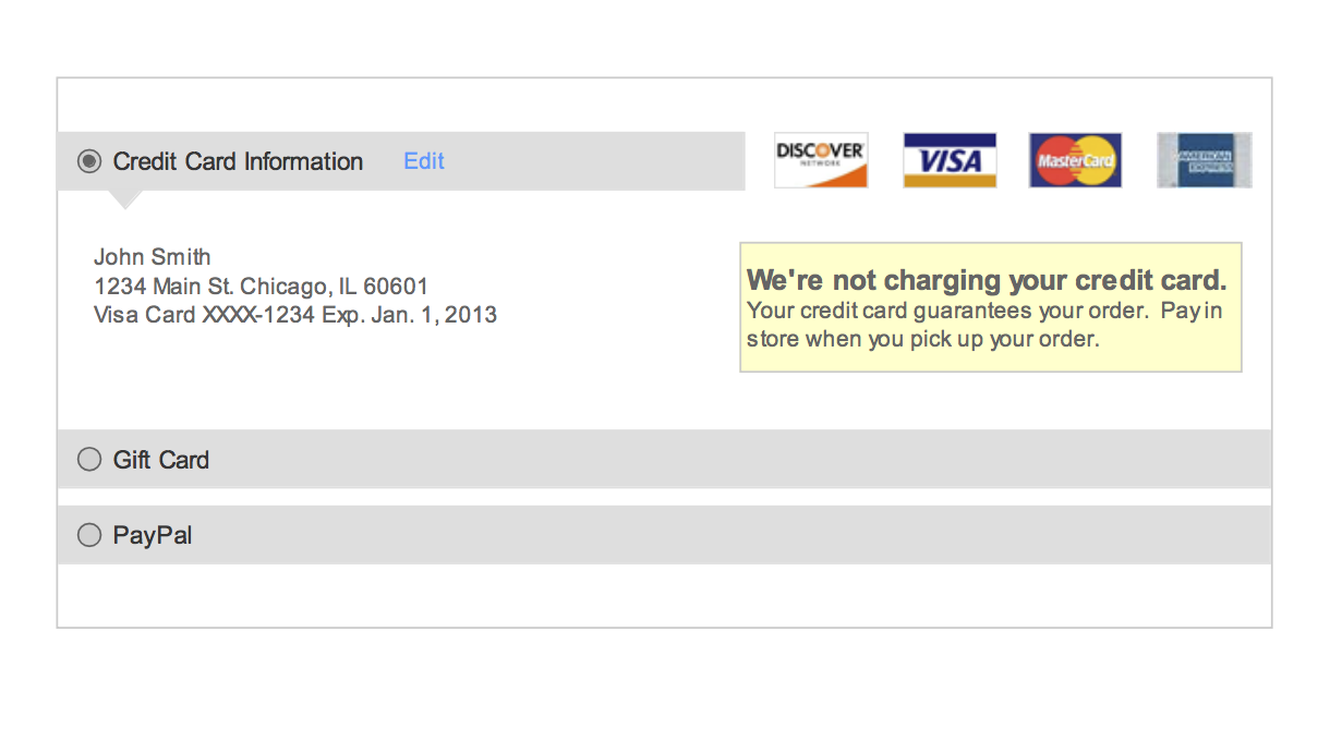
THE MONEY SOLUTION
When payment information is not required, do not display it. Otherwise, messaging, along with simple use of warning colors can be a very simple solution.

KEY ANALYTICS
While analyzing quantitative data about the checkout experience, we found a few interesting points that helped guide design decisions.
- • 90% of online orders are picked up at stores
- • Of the 90%, about 80% are always picked up at the same store location and roughly 15% are picked up at two different stores at the most. This in turn means that 90% of pickup orders are fulfilled at two or less stores
- • Customers are never charged for their pickup orders within the online experience. The financial transaction takes place at the time of pickup

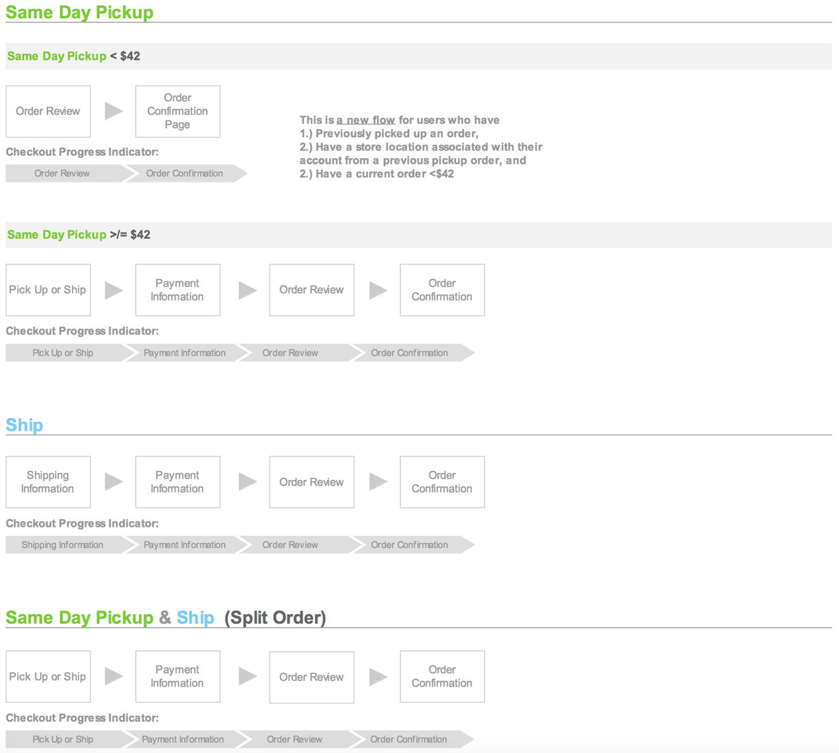
THE REVAMPED EXPERIENCE
After several months of research, design iterations, usability studies and conversations, we have delivered a new, revamped checkout experience.
DESIGN

MARKETPLACE
The Gobbler Marketplace is a revolutionary ecommerce platform bringing the subscription model to the world of audio plugins. Home recording enthusiasts, professional audio producers, radio station and tv audio engineers have an opportunity to add world class audio plugins to their arsenals on demand.
TRAVEL APPLE WATCH
During this short and very fast paced project, my initial goal was to understand the anatomy and design capabilities of the Apple Watch. Without the actual device in my hands, the most reliable source of knowledge was the Apple Watch Human Interface Guidelines document. Armed with patience, but eager to begin the design process, I set out to do some research.


EMAIL DESIGN
The project called for collecting information about every single email sent out to the users by the system, then standardizing the language, appearance and building new HTML/CSS templates.

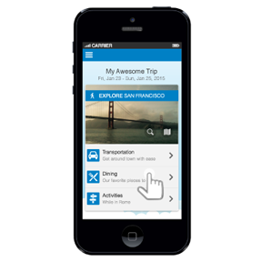
MOBILE EXPLORE CARD
The Mobile Explore Card is meant to be a personalized, data driven solution allowing travelers to explore the area they are visiting.
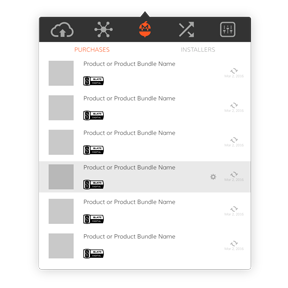
OS X CLIENT APP CONCEPTS
Aside from syncing and versioning backed up creative assets, the Gobbler Client App offers a unique ability to license and manage audio plugin subscriptions purchased through the Gobbler Marketplace. This concept project focused on redesigning those screens.
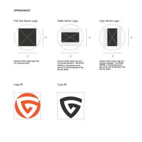
PUBLISHER DESIGN GUIDELINES
The Publisher Design Guidelines is an all encompassing visual style guide providing publishers with the information they need in order to produce appropriate visual assets for use within the Gobbler universe.
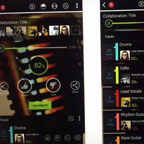
MUSIC COLLABORATION
Audiocitizen is meant to help recording artists enhance creativity and increase exposure by offering a simple and effective music collaboration tool. It presents an opportunity to showcase musical talent driven by constant, round-the-clock outpour of creativity through crowdsourcing.
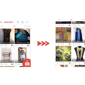
MOBILE USABILITY IMPROVEMENTS
I had a chance to play around with a beautifully designed Japanese mobile app Mercari. According to the company, "Mercari is the biggest community-powered shopping fair in the palm of your hand. Shop from thousands of sellers with one-click purchases, and quickly sell your own new, pre-owned or handmade items." It's an amazing app, however, during my review, I took a stab at the top 10 usability improvements the app could use before moving to the U.S. market. Check them out!