PUBLISHER DESIGN GUIDELINES

Gobbler offers audio plugin publishers a unique opportunity to sell their software in form of subscriptions, while allowing users to seamlessly purchase, activate and use those products standalone or within their DAW (Digital Audio Workstation) environments. Gobbler consists of several components, each with its own technical and visual requirements. The Publisher Design Guidelines is an all encompassing visual style guide providing publishers with the information they need in order to produce appropriate visual assets for use within the Gobbler universe.
WEB EXPERIENCE
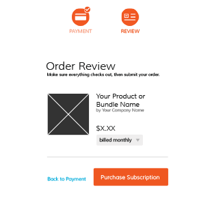
Product images on the web are users’ first visual contact with the product. They represent the entire purchased subscription in the Gobbler Marketplace. The document outlines the assets' format and sizing, as well as the context they will live in.
FORMAT AND SIZING
The way web assets should be delivered to Gobbler.

CONTEXT
Where and how the web assets will appear.

CLIENT EXPERIENCE
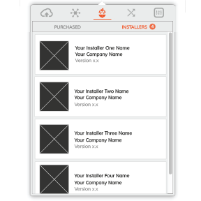
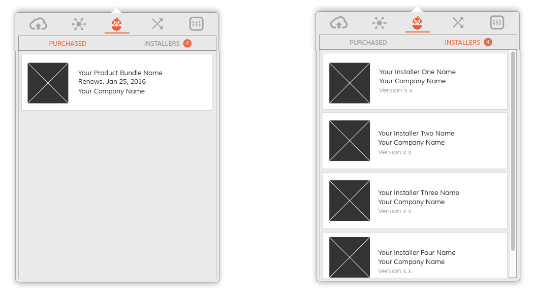
The Gobbler Client App is the place where users go to install and manage their newly purchased subscriptions. Product images represent the entire purchased subscription in the Gobbler Marketplace, while Installer images showcase individual products within bundles. As with the Web Experience guidelines, this portion of the document also specifies format and sizing, as well as the context.
FORMAT AND SIZING
The way client assets should be delivered to Gobbler.

CONTEXT
Where and how the client assets will appear.
DESIGN

MARKETPLACE
The Gobbler Marketplace is a revolutionary ecommerce platform bringing the subscription model to the world of audio plugins. Home recording enthusiasts, professional audio producers, radio station and tv audio engineers have an opportunity to add world class audio plugins to their arsenals on demand.
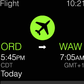
TRAVEL APPLE WATCH
During this short and very fast paced project, my initial goal was to understand the anatomy and design capabilities of the Apple Watch. Without the actual device in my hands, the most reliable source of knowledge was the Apple Watch Human Interface Guidelines document. Armed with patience, but eager to begin the design process, I set out to do some research.


EMAIL DESIGN
The project called for collecting information about every single email sent out to the users by the system, then standardizing the language, appearance and building new HTML/CSS templates.

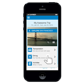
MOBILE EXPLORE CARD
The Mobile Explore Card is meant to be a personalized, data driven solution allowing travelers to explore the area they are visiting.
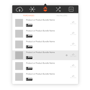
OS X CLIENT APP CONCEPTS
Aside from syncing and versioning backed up creative assets, the Gobbler Client App offers a unique ability to license and manage audio plugin subscriptions purchased through the Gobbler Marketplace. This concept project focused on redesigning those screens.
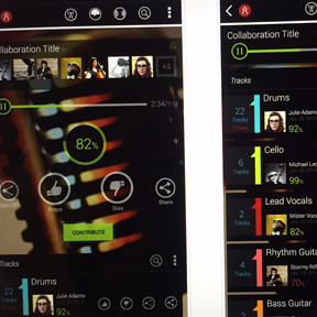
MUSIC COLLABORATION
Audiocitizen is meant to help recording artists enhance creativity and increase exposure by offering a simple and effective music collaboration tool. It presents an opportunity to showcase musical talent driven by constant, round-the-clock outpour of creativity through crowdsourcing.
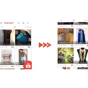
MOBILE USABILITY IMPROVEMENTS
I had a chance to play around with a beautifully designed Japanese mobile app Mercari. According to the company, "Mercari is the biggest community-powered shopping fair in the palm of your hand. Shop from thousands of sellers with one-click purchases, and quickly sell your own new, pre-owned or handmade items." It's an amazing app, however, during my review, I took a stab at the top 10 usability improvements the app could use before moving to the U.S. market. Check them out!
E-COM CART & CHECKOUT REDESIGN
It’s the cash register we’re talking about here. Yeah, it’s kind of important that it works. Otherwise, we might as well pack up our bags and look for an entertaining project elsewhere. No moola, no fun and games.