TRAVEL APPLE WATCH

During this short and very fast paced project, my initial goal was to understand the anatomy and design capabilities of the Apple Watch. Without the actual device in my hands, the most reliable source of knowledge was the Apple Watch Human Interface Guidelines document. Armed with patience, but eager to begin the design process, I set out to do some research.
APP STRUCTURE
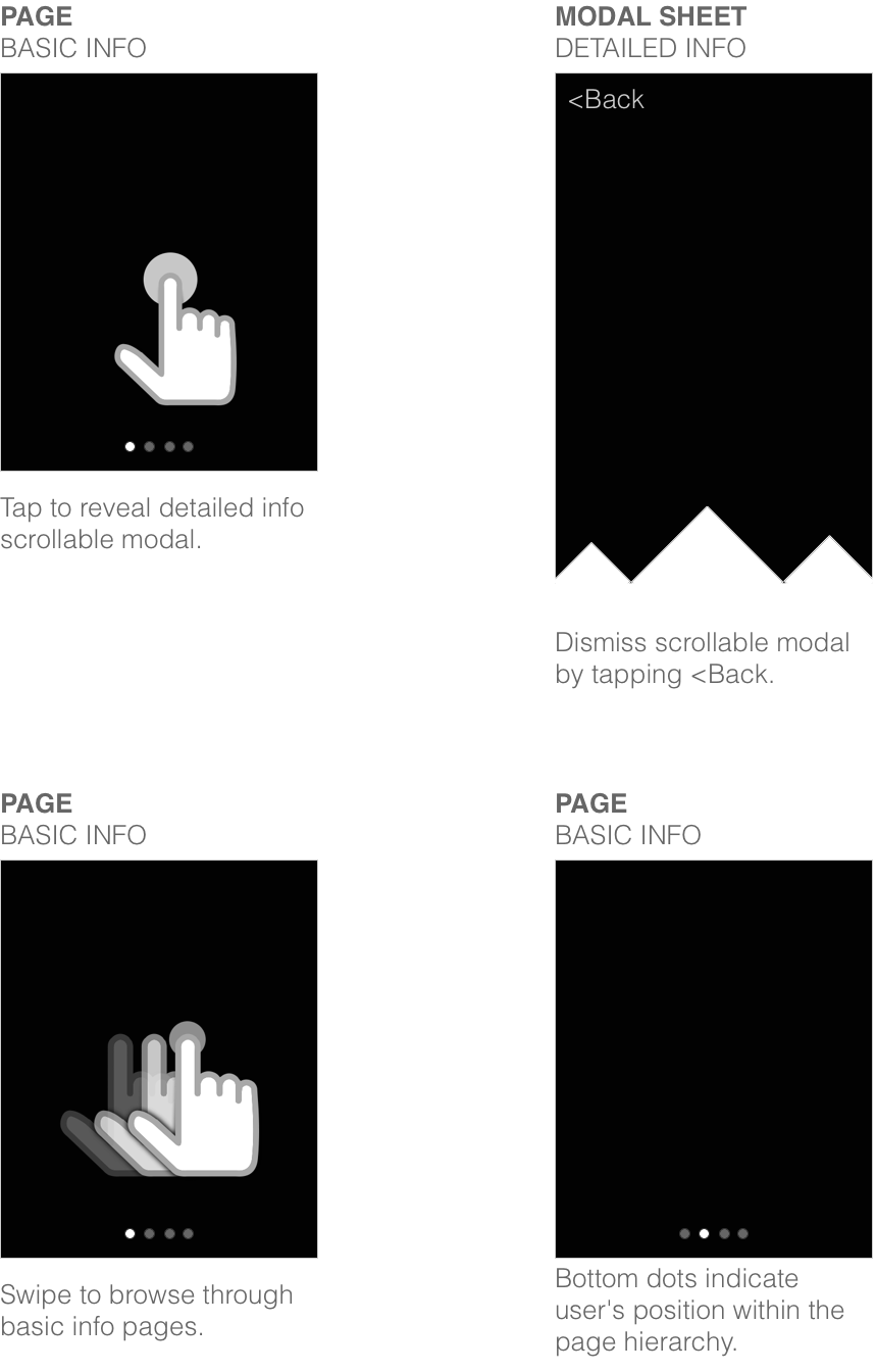
It is worth mentioning that the design guidelines were in their very early stage at that point and have expanded tremendously since. At a first glance (pun intended), it felt challenging to imagine the watch's design patterns with its notifications, short looks, long looks, glances and alerts without being able to actually interact with the device. But after some time of experimenting, several emails from the device's creators along with a multitude of iterations, we were well on our way to creating the app's structure.
THE CONTENT
Given the project’s short time frame, the next step was to identify the most relevant and useful information to the users. We had to go with our previous knowledge of the mobile app and a bit of gut feeling on this. We knew that different pieces of information were relevant to travelers at different stages of their trips, but it was impossible to cram all of that data into the watch’s tiny display. Through collaborative brainstorming sessions we decided to imagine an average user’s trip and extract only the most critical snippets of information from it.
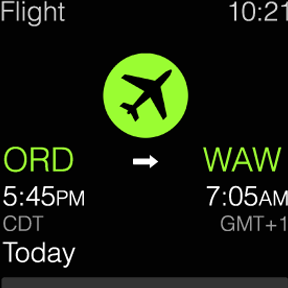
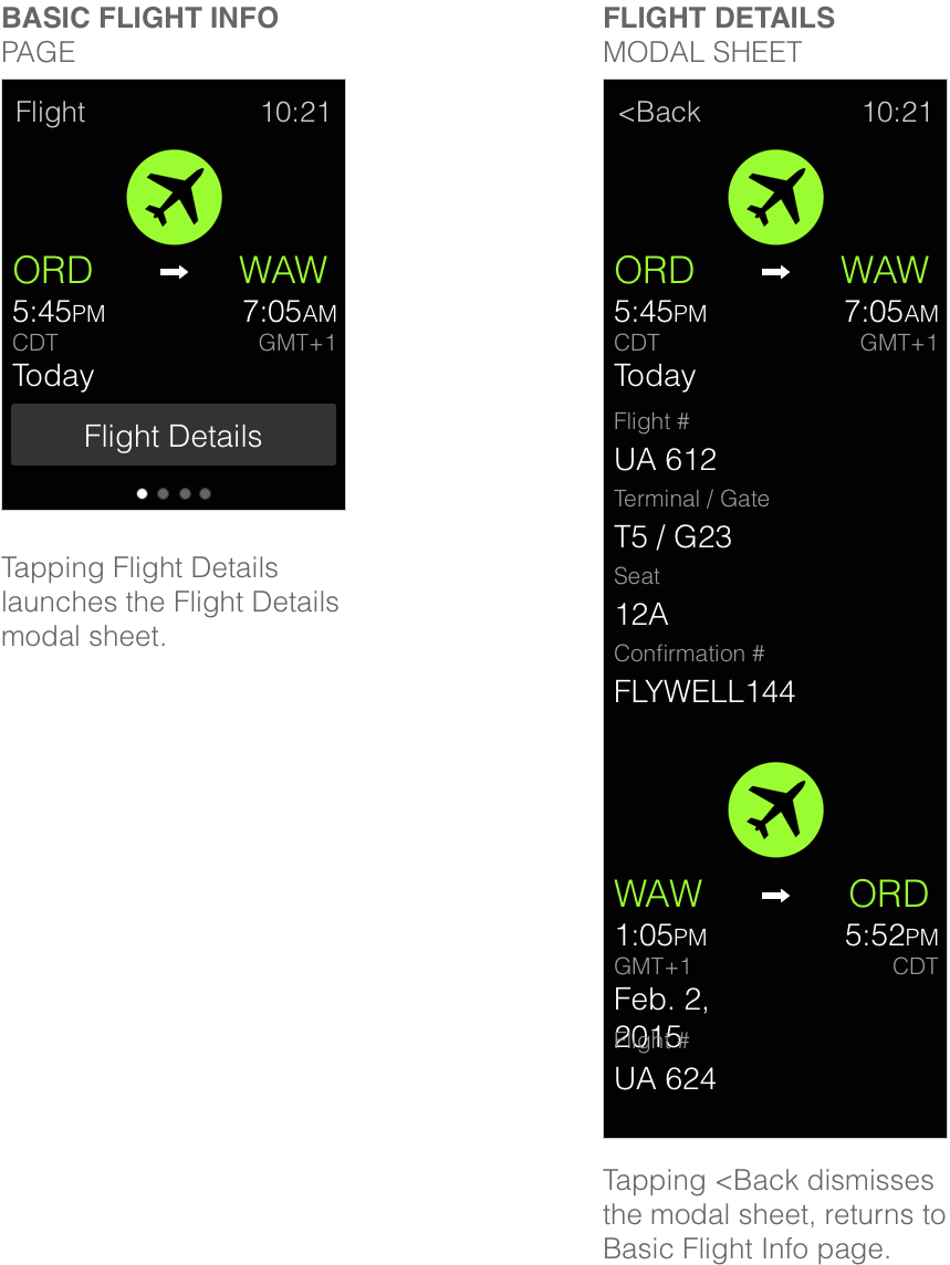
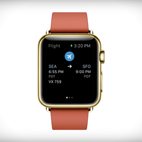
FLIGHT INFORMATION
The natural first choice was the Flight Information screen, since it's usually the first main step of any trip. But what information do we look for a day, the morning of, three hourse before our flight? How about once we're at the airport or on the plane? The level of detail of course varies in each of these scenarios, but the basics remain the same - When am I flying? Where am I flying? Is my flight on time? What gate does it depart from? What's my seat number?
It seems like a lot of relevant information to fit into a roughty 4cm² display. Use of color was important in accomplishing that. The green in the following examples is meant to communicate a hassle-free event. In case of delayed or canceled flights, or other unforseen events, the idea was to use warning colors such as orange or red. The ability to hide more information within scrollable modal sheets accessed by the Details button also proved very useful.
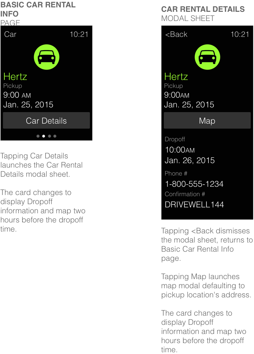
CAR RENTAL INFORMATION
What do travelers usually do after they land at their destination airports? They pick up their rental car. Where the car can be found and how to get a hold of the rental agency surfaced as important pieces of information. Pickup date and time also seemed important, especially during overnight travel.
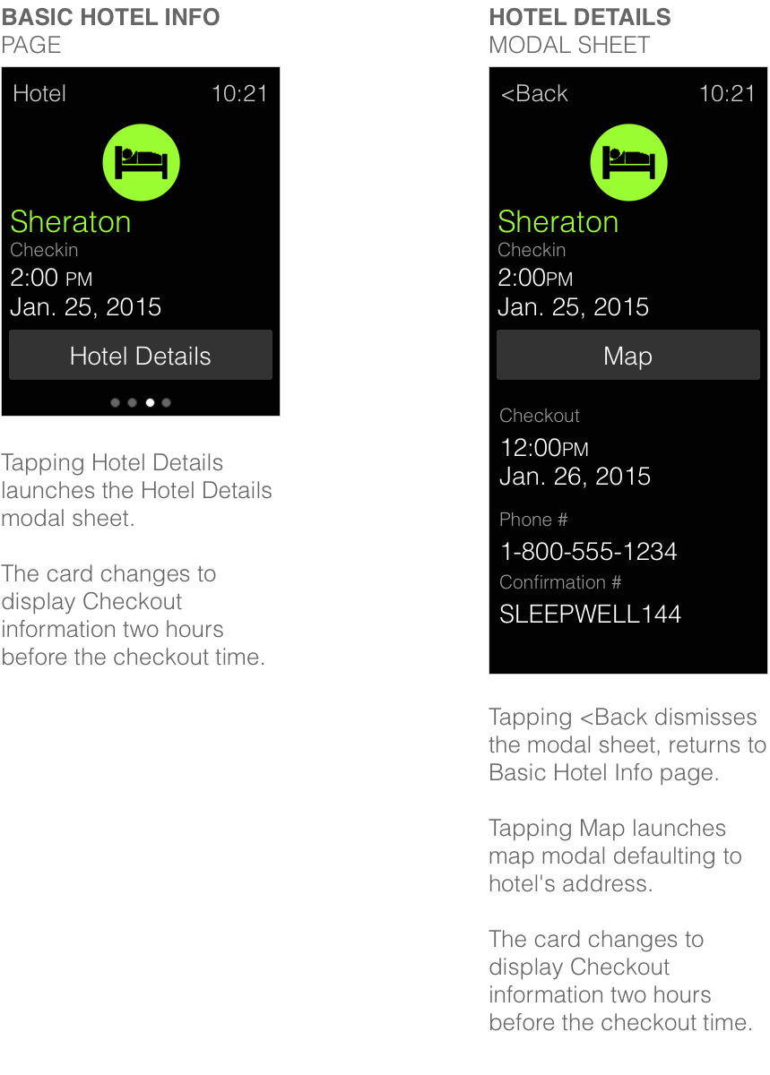
HOTEL INFORMATION
Following the previously established patterns of color usage, date, time and location...
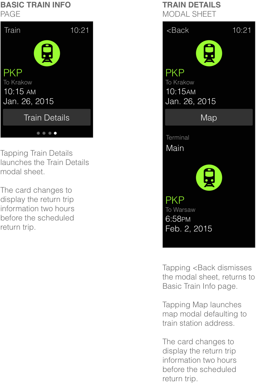
GROUND TRANSPORTATION INFORMATION
At this point the patterns were well established and it felt like we were only filling in the blanks. Carrier information, destination, time and date seemed like very obvious choices for the Ground Transportation screens. As previously established, tapping the Details button revealed more information.
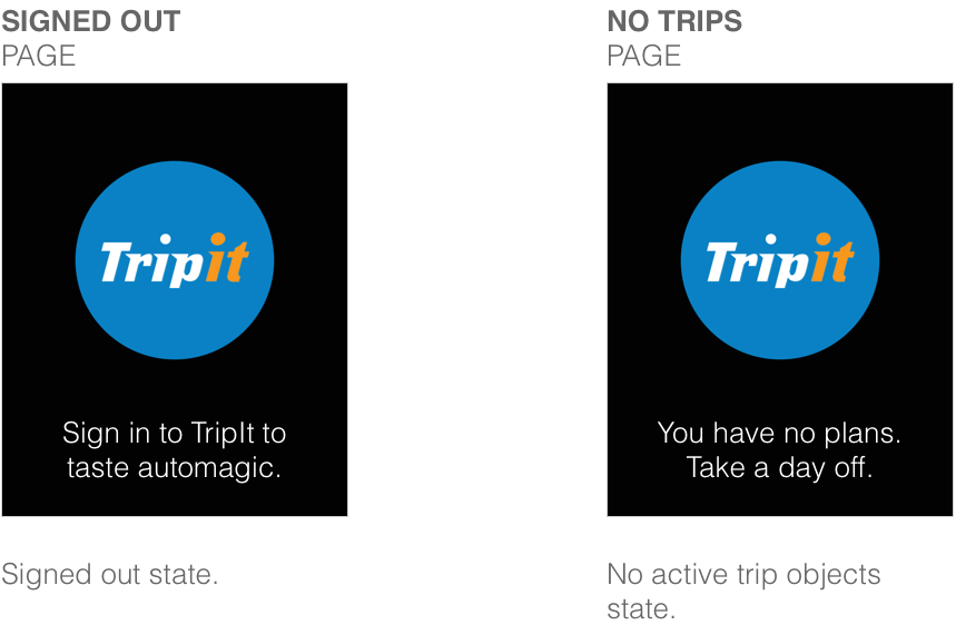
NEGATIVE STATES
What's a great app without its negative state screens.
THE BIG ANNOUNCEMENT
After polishing the designs and spending two days working with an amazing developer, the prototype of the app was born. I had left the company soon after, but later stumbled upon this official video of the app's release. I have to say, it really made my day.
DESIGN

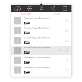
MARKETPLACE
The Gobbler Marketplace is a revolutionary ecommerce platform bringing the subscription model to the world of audio plugins. Home recording enthusiasts, professional audio producers, radio station and tv audio engineers have an opportunity to add world class audio plugins to their arsenals on demand.


EMAIL DESIGN
The project called for collecting information about every single email sent out to the users by the system, then standardizing the language, appearance and building new HTML/CSS templates.

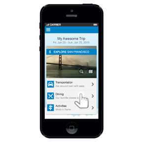
MOBILE EXPLORE CARD
The Mobile Explore Card is meant to be a personalized, data driven solution allowing travelers to explore the area they are visiting.
OS X CLIENT APP CONCEPTS
Aside from syncing and versioning backed up creative assets, the Gobbler Client App offers a unique ability to license and manage audio plugin subscriptions purchased through the Gobbler Marketplace. This concept project focused on redesigning those screens.
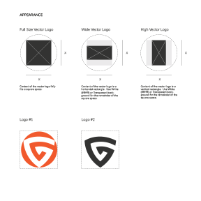
PUBLISHER DESIGN GUIDELINES
The Publisher Design Guidelines is an all encompassing visual style guide providing publishers with the information they need in order to produce appropriate visual assets for use within the Gobbler universe.
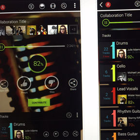
MUSIC COLLABORATION
Audiocitizen is meant to help recording artists enhance creativity and increase exposure by offering a simple and effective music collaboration tool. It presents an opportunity to showcase musical talent driven by constant, round-the-clock outpour of creativity through crowdsourcing.
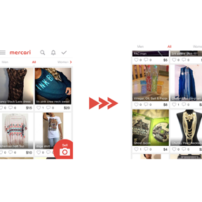
MOBILE USABILITY IMPROVEMENTS
I had a chance to play around with a beautifully designed Japanese mobile app Mercari. According to the company, "Mercari is the biggest community-powered shopping fair in the palm of your hand. Shop from thousands of sellers with one-click purchases, and quickly sell your own new, pre-owned or handmade items." It's an amazing app, however, during my review, I took a stab at the top 10 usability improvements the app could use before moving to the U.S. market. Check them out!
E-COM CART & CHECKOUT REDESIGN
It’s the cash register we’re talking about here. Yeah, it’s kind of important that it works. Otherwise, we might as well pack up our bags and look for an entertaining project elsewhere. No moola, no fun and games.